Essential
One idea per section. Clear hierarchy. No decoration added to make an ordinary point feel important.
ORCA IQ brand identity
Every vacancy and BD conversation, scored against your own standard of best practice.
Professional. Commercial. Conversational. Short.
The system in one line
ORCA IQ makes unseen call quality visible. The identity follows the same logic. Teal Black carries the page. Card Teal lifts the panels. Signal Teal is the one bright colour, and it glows only where a visitor should look: the ask bar, the product window, the action.
The writing stays direct. We talk about vacancy quality, BD conversations, fees and revenue at risk. The technology never becomes the story.
Foundation
The layout is spare because the content is useful. The system is dark because the subject lives below the surface. Every decision has a job.
One idea per section. Clear hierarchy. No decoration added to make an ordinary point feel important.
Start with the recruitment problem. Quality, consistency and revenue earn attention. Software features follow.
Use the grid, the tokens and the type scale. Nothing is eyeballed. Repetition creates trust.
Foundation
Three brands share a surname. The rules that keep them apart are not stylistic preferences.
Signal Teal #2ED3C0 is the one bright colour: pills, the marked word, the glow. Oceanic Teal #026B7E and Fjord Cyan #0F91B2 survive inside the product app and in gradient stops within art, never as the lead on a marketing surface.
#7C3AED and its family are dead. Bringing purple back as a legacy or heritage accent is a violation, not a nod.
ORCA Blue #1B9FE8 is the trainwithorca brand, Call Coach heritage. ORCA IQ never leads with blue. The Powered by ORCA lockup is the only place parent branding appears.
Serif belongs to Bamboo, a different brand in the family. Inter and Space Grotesk are also banned. General Sans is the face on every marketing surface from 5 September 2026; Archivo and Lato remain inside the product app until it migrates.
Foundation
Lowercase orca. Uppercase IQ. Quiet confidence, with the intelligence layer picked out in Signal Teal. It may sit inline in a headline.
Visual system
The brand hue lives in the page itself, never a neutral black. Signal Teal is the one bright colour: pills, the marked word, the glow.
Three teal-black grounds by depth, one card colour with a hairline, one bright teal for every action and every light, and two whites. Orange appears once, on the IQ badge and product names, the way a superscript does.
Teal Black. The page. Never neutral black: the brand hue is in the ground itself.
Deep Side. The fixed sidebar and the hero, one step darker than the page.
Seabed. Footer and the darkest band.
Card Teal. Cards and raised panels, with a 1px Signal Teal hairline at 16 to 28 per cent.
Signal Teal. The one bright colour. Filled pills, the marked word in a headline, the submit disc, and every glow.
Ice White. Headlines and primary copy. Headlines may go to pure #FFFFFF.
Dim Teal. Captions, rules, sidebar links at rest. Body copy runs Ice White at 70 per cent.
For high-glare working environments and long-form documents. Teal remains an action colour. It never floods the canvas.
Colour ruling
No purple. No neutral black. No second bright colour beside Signal Teal except the orange badge. Glow belongs to the hero light, the ask bar and the product window, nowhere else.
Visual system
General Sans replaced Archivo and Lato on marketing surfaces on 5 September 2026. Weight 600 for display with tight negative tracking, 400 for copy, 500 for controls, 700 for card titles and big numbers.
Display / General Sans 600
Win the floor with every call.
Body / General Sans 400
Every conversation scored against your own standard of best practice. Managers see what was missed and where to act.
WHAT ORCA FOUND THIS WEEK
The numeral rule
General Sans ships tabular figures. Always pair numerals with font-variant-numeric: tabular-nums, and check any stat above 40px visually before it ships. Inside the product app, Lato still carries the numbers until the app migrates.
Why Raleway went, and why Lato followed
Raleway was retired on 28 July 2026. It ships no tnum table and its digit advances vary 18.5 per cent, from 518 to 614 units, so the brand's own rule that every numeral is tabular was impossible to execute in it. At 50px in the product's KPI strip the glyphs of 312 physically overlapped. Its heavy weights also compress counters rather than widening them, so it collided with itself above roughly 40px.
Visual system
Borrow the discipline of an engineering manual. Keep the work open, aligned and deliberate.
The navigation rail occupies its own field. Content uses repeatable 4 / 8 and 3 / 9 relationships.
Collapse structure, not hierarchy. Labels lead. Specimens span the available width.
Start at 8px. Use 16, 24, 32, 48, 64 and 96. Break the rhythm only when the content explains why.
Centred sections, 96 or 112px of padding, content at 1184px max. A 208px fixed sidebar carries the navigation and the copyright; actions sit top right. One idea per band: heading, lead, one control, then the exhibit.
24px on cards, images and windows. 999 on pills, inputs and the submit disc. Square corners are retired on every marketing surface from 5 September 2026. The product app still carries the v1 radii of 16, 11 and 9px until it migrates.
One radial Signal Teal light behind the hero; a glow on the ask bar (40px at 40 per cent, 120px at 25 per cent) and on the product window. Nothing else casts light. Cards use a hairline, not a shadow.
One joined panel with internal dividers, never separate floating stat cards.
Checkmark and cross lists for can-see versus cannot-answer are a house pattern: green ticks, red crosses inside a red-tinted panel.
Mock data must look plausible and stay internally consistent. Never present it as customer data. The house fictional tenant is Northline Search, with consultants Maya Ellison, Josh Bracewell, Priya Anand, Callum Reid and Sofia Nkemi.
Imagery ruling
Show the actual product: a report window with the six-pillar radar, the Field, a scored call, the Library. Illustrated art in the brand grade (silk, wireframe brains, boards) is allowed on cards and covers. No stock photography, no team-at-whiteboard imagery.
Visual system
Working specimens of the v4 system as built on the website. Figures are fictional and exist only to show the system.
Specific, commercial and easy to recognise.
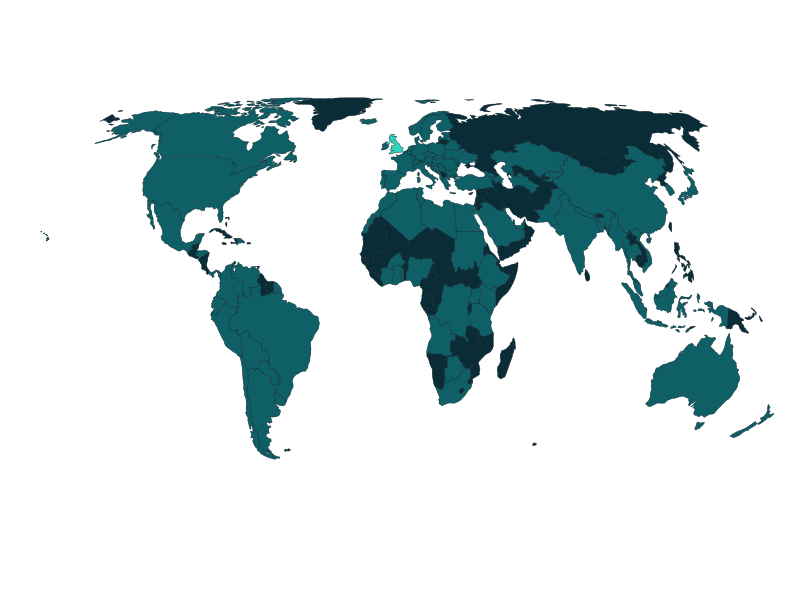
Silk in the brand grade; the map with the UK lit. 24px corners, no shadow.

Every pattern on the website, with the numbers that build it.
One joined panel. Internal dividers. No floating tile set.
Language
Experienced recruitment people do not need software theatre. Name the problem. Show the commercial logic. Stop.
Professional. Commercial. Conversational. Short. Write like an experienced recruitment operator talking to another, not a software company talking to a market. Concrete nouns. Numbers where they earn their place. Confident, never hyped. Plain-spoken about limitations; trust is the product.
Activity is measured.
But quality is invisible.
The language ruling
We sell performance intelligence and revenue. Coaching is the mechanism, never the headline. AI never appears in a headline, hook or subject line.
vacancy qualification / qualification call / BD call / scored / consistency / quality and quantity / billing managers / placements / revenue at risk / blind spots / best practice
AI-powered / revolutionary / game-changing / cutting-edge / next-generation / disruptive / leverage / unlock / supercharge / seamless / robust / holistic
Dashes
No em dashes or en dashes in any copy that ships. Use periods, commas, colons, parentheses.
Quadrant language
Quadrant language is locked: Busy Fool, Lazy Expert, Perfect Consultant, At Risk Consultant. These four names are the only labels used, in the product and in every asset. Do not paraphrase them.
Visual system
Dark is the default. Light is where the work happens.
Everything a prospect or a market sees: the website, ads, decks, carousels, social artefacts, covers, demo mini-sites and this site. Teal Black #061C22 page, Deep Side #04151B sidebar and hero, Card Teal #082A33 panels with a Signal Teal hairline, one radial teal light behind the hero, white headlines with one word in Signal Teal.
Two places: the product app, which is light-first at #F0F6F7 page, white cards, teal as accent only; and long-form documents, which may run light with dark panels as deliberate contrast moments. Nothing else. An internal tool being looked at all day is not a reason to go light.
The test
Dark is the default and the answer unless there is a reason otherwise. Light is not earned by how long a screen is looked at: internal tools, dashboards and team surfaces stay dark. Light is reserved for the product app, which is light-first, and for long-form documents. Anything else starts dark.
Signal law
Green, amber and red encode performance state and nothing else. Red is never a decorative accent, never a heading colour. Fjord Cyan is never a score band; it is the brand. If something needs emphasis but carries no performance meaning, use cyan.
Accessibility
Darren is colour-blind and reads red and amber as near-identical. The analytics layer carries a colour-blind-safe toggle which swaps the ramp for a magenta, yellow and teal triad that separates by lightness as well as hue. It is a viewer preference, not a default.
Still open
Signal colours were chosen against the purple system and have not been re-picked for the teal ground. They work. They were not designed for it.
Collateral
The link you send never changes. It becomes the post-demo page after the meeting.
One domain per prospect, live for the whole cycle. The client URL never changes: it serves the pre-demo page before the meeting and is rebuilt from the post-demo template afterwards, so the prospect keeps a single link that evolves.
Cross-pollination
Improve a client site and the improvement belongs back in the template. Improve a template and it flows to the next client. The template domains are the source of truth.
Collateral
One emphasis per asset. The CTA mirrors the product, never a generic SaaS button.
Carousel pack
Do not use until migrated. It is still purple and still Raleway.
Governance
The tells that an asset was made without thought. Naming them means nobody has to debate them later.
The final test
Improve every vacancy.
Coach the floor better.
Make more money.